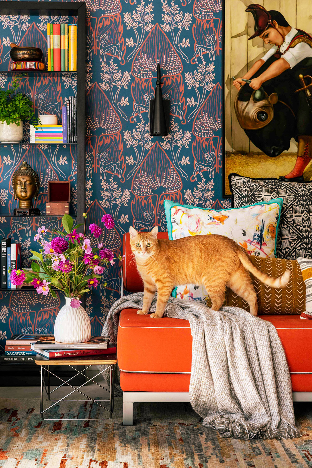

It is easy to believe that finding your personal design style means choosing one established label.
English cottage. Traditional. Mid-century modern. Farmhouse. Art Deco. Coastal. Bohemian. Scandinavian.
These categories can be helpful. They give us a shared visual language and help us recognize recurring combinations of architecture, furniture, materials, color, and ornament. The difficulty comes when no single label describes everything we love.
You may admire the warmth and age of an English cottage, the cleaner lines of modern design, the elegance of traditional interiors, and the expressive color of an eclectic home. You may want rooms that feel refined but comfortable, airy but grounded, timeless but personal.
That does not mean your taste is confused.
Most personal styles are combinations. They develop through memory, environment, practical needs, collected objects, changing interests, and the way we want our homes to feel. Rather than forcing all of those preferences beneath one design label, it can be more useful to describe your ideal home through a carefully chosen group of words.

Those words become a filter.
They help you decide which colors belong, which materials feel right, which objects support the atmosphere, and whether a possible purchase fits the longer vision for your home.
A design label may tell you where to begin. Adjectives help you make the home your own.
“Styles come and go. Good design is a language, not a style.”
—Massimo Vignelli
Design Styles Are References, Not Rules

Established styles are useful because they collect recognizable design ideas in one place.
English cottage often suggests floral fabrics, collected furniture, natural materials, old wood, books, botanical details, and a sense of comfort developed over time. Art Deco may suggest geometry, glamour, symmetry, lacquer, rich color, metallic finishes, and sculptural forms. Scandinavian design is associated with pale colors, simplicity, natural light, and functional pieces.
Each style offers a visual vocabulary.
You can study that vocabulary without reproducing every part of it. Perhaps you love the botanical patterns and aged furniture of cottage interiors but prefer more open surfaces. You might admire Art Deco lighting without wanting an entirely glamorous room. You may appreciate the practicality of modern design while still wanting softness, ornament, and visible history.
Your home can borrow from several traditions and still feel cohesive.
Cohesion comes from repetition and relationship. Colors recur. Materials speak to one another. Shapes are echoed. The overall atmosphere remains recognizable from room to room.
A home does not need to belong perfectly to one category. It needs a clear enough language that its different elements feel as though they were chosen for the same story.
Consider the Age and Architecture of the Home

Personal style matters, but the home itself also has a voice.
Its build year, architecture, proportions, materials, and surviving original details can offer useful clues about what may feel naturally at home there. Window shapes, ceiling height, trim, doors, flooring, fireplaces, built-ins, and room layout all contribute to the character of the space.
An older home may already carry elements of Craftsman, Victorian, Tudor, Colonial, cottage, or mid-century design. A newer home may have more open rooms, simpler trim, larger windows, or fewer architectural details to work from.
You do not need to decorate according to the exact period in which the house was built. A home should still reflect the people living there now. However, noticing its original language can help you make choices that feel more connected to the building rather than placed upon it.
Ask:
- What architectural details are already present?
- Which materials and proportions feel original to the home?
- Are there features worth emphasizing rather than covering?
- Which newer elements feel harmonious with the structure?
- Where could contrast feel intentional rather than accidental?
A 1920s home can contain modern furniture. A contemporary home can hold antique pieces. The aim is not historical purity. It is thoughtful relationship between the home’s existing character and the life being created within it.
Begin With the Question: How Do I Want to Feel Here?

Before choosing furniture, paint colors, or decorative objects, ask:
How do I want to feel in this space?
This question often reveals more than asking what style you like.
A bedroom might need to feel quiet, sheltered, soft, and restorative. A kitchen may need to feel cheerful, useful, warm, and abundant. A living room could feel conversational, grounded, collected, and welcoming.
The words may change from room to room, but they should still relate to the broader character of the home.
Consider how you want to feel:
- when you enter the house
- while preparing food
- when sitting alone
- while welcoming guests
- at the beginning of the day
- when the house becomes quiet at night
- during winter
- when the windows are open in summer
- while working, creating, resting, or gathering

Emotional language belongs in design because rooms affect emotion. Light, color, scale, texture, sound, order, and enclosure all shape the way a space feels.
Begin with feeling, then translate that feeling into visual decisions.
Gather Inspiration Before Trying to Name Your Style

If you are unfamiliar with design terminology, begin by gathering rooms, details, and objects that appeal to you before trying to identify a style.
Useful places to explore include:
- Houzz
- interior design magazines
- decorating and architecture books
- library design collections
- historic-home and house-museum websites
- home tours
- antique shops and architectural salvage stores
- real-estate listings for older or distinctive homes
- films and television with memorable interiors
- hotels, restaurants, gardens, and public spaces
- the homes of artists, writers, and designers
Pinterest is especially useful for creating a broad collection quickly. Save freely at first, without worrying about whether the rooms belong to the same named style.

Once you have gathered enough images, review them as a group and look for repetition.
Ask:
- Which colors appear again and again?
- Do I prefer dark, enveloping rooms or pale, open ones?
- Are the furniture lines curved, straight, delicate, or substantial?
- Do I repeatedly save painted wood, natural wood, stone, brass, glass, or woven materials?
- Are the rooms restrained or richly layered?
- Do they feel polished, weathered, formal, rustic, playful, or collected?
- Which details attract me most: the architecture, furniture, color, lighting, textiles, or atmosphere?
You may discover that the images carry several different design labels but share the same underlying qualities. A cottage kitchen, a traditional living room, and an organic modern bedroom might all appeal to you because they are warm, natural, textured, quiet, and grounded.
The repeated qualities are often more useful than the labels.
When using Pinterest or another visual platform, try to save individual details as well as complete rooms. A paint color, window treatment, chair shape, carved cabinet, patterned fabric, or combination of materials may reveal your preferences more clearly than a highly styled room considered as a whole.
Separate Style Labels From Descriptive Words

It helps to make two different lists.
The first contains recognized styles and aesthetic traditions. These can provide inspiration and help you identify repeated features you enjoy.
The second contains descriptive words. These express the mood, qualities, materials, and functions you want the home to carry.
Style and Aesthetic References
These are broader design categories or recognizable visual traditions:
- Art Deco
- Art Nouveau
- Arts and Crafts
- Bauhaus
- Bohemian
- British Colonial
- Coastal
- Cottage
- Cottagecore
- Country
- Eclectic
- English cottage
- English country
- European farmhouse
- French country
- Georgian
- Grandmillennial
- Hollywood Regency
- Industrial
- Japandi
- Mediterranean
- Mid-century modern
- Minimalist
- Modern
- Modern farmhouse
- Neoclassical
- Nordic
- Organic modern
- Parisian
- Postmodern
- Regency
- Retro
- Rustic
- Scandinavian
- Shaker
- Southwestern
- Traditional
- Transitional
- Tudor
- Victorian
- Vintage

You may be drawn strongly to one of these, or you may identify several that contain elements you want to combine.
Instead of trying to name the combination, look beneath the labels. Ask what specifically attracts you.
Is it the dark wood? The curved lines? The handmade quality? The floral pattern? The simplicity? The age? The symmetry? The sense of abundance?
Those answers lead to your descriptive words.
Build Your Home’s Word Bank

Style and Visual Character
These words describe the visible personality of the home:
- artistic
- botanical
- classic
- collected
- colorful
- contemporary
- crafted
- eclectic
- elegant
- expressive
- feminine
- formal
- graceful
- handmade
- historic
- layered
- masculine
- minimal
- nostalgic
- old-world
- ornate
- playful
- refined
- romantic
- rustic
- sculptural
- simple
- tailored
- timeless
- traditional
- unfussy
- vintage
- whimsical
Mood and Atmosphere
These words describe how the home should feel:
- airy
- calm
- cheerful
- comforting
- contemplative
- cozy
- dramatic
- dreamy
- earthy
- energetic
- grounded
- intimate
- joyful
- lighthearted
- lively
- magical
- moody
- peaceful
- quiet
- relaxed
- restorative
- romantic
- serene
- sheltered
- soft
- soulful
- spacious
- sunlit
- warm
- welcoming
Texture, Material, and Finish
These words describe the physical and sensory qualities of the space:
- aged
- burnished
- carved
- crisp
- distressed
- embroidered
- glossy
- grainy
- handmade
- matte
- natural
- painted
- patinated
- polished
- raw
- ribbed
- rough
- smooth
- softened
- tactile
- timeworn
- unfinished
- weathered
- woven
You might also name materials directly:
- brass
- cane
- clay
- glass
- iron
- leather
- linen
- marble
- natural fiber
- paper
- plaster
- rattan
- stone
- terracotta
- velvet
- wood
- wool
Space, Rhythm, and Function
These words describe how the home works and how its rooms are arranged:
- adaptable
- balanced
- breathable
- comfortable
- conversational
- efficient
- flexible
- flowing
- functional
- generous
- gathered
- intimate
- layered
- livable
- open
- orderly
- practical
- restful
- spacious
- uncluttered
- useful
- welcoming
- well-defined
These may seem less decorative, but they matter just as much. A room can contain the right colors and furniture while still feeling wrong because it is difficult to move through, lacks comfortable seating, or does not support what happens there.
Choose a Small Group of Guiding Words
Too many words can become as confusing as too many design labels.
Begin by choosing approximately four to six adjectives for the home as a whole. These should describe the qualities you want to return to repeatedly when choosing colors, furniture, finishes, textiles, artwork, and decorative objects.
You may also select one or two established styles as reference points. The style references offer visual inspiration, while the adjectives determine how those influences are interpreted in your own home.
For example, my own current design language is:
Vintage · romantic · refined · warm · timeless
My primary style reference is Cottage, with selective inspiration from Art Nouveau.
Cottage interiors support the warmth, age, softness, and lived-in quality I want. Art Nouveau contributes graceful curves, botanical forms, craftsmanship, and meaningful ornament. I do not need every room to look historically cottage or distinctly Art Nouveau. I can borrow the qualities that support the larger vision.
Together, these words suggest a home with:
- vintage and antique pieces
- warm, softened colors
- floral and botanical details
- graceful shapes and curved lines
- traditional materials
- objects that appear collected over time
- refinement without excessive formality
- romantic details balanced by practical comfort
- design choices that can outlast a passing trend
A different person’s design language might be:
Calm · earthy · sculptural · tactile · uncluttered
with Organic Modern as a style reference.
Another might choose:
Colorful · playful · nostalgic · handmade · relaxed
with Cottage and Eclectic influences.
Your words should be specific enough to guide decisions without becoming so restrictive that the home cannot change or absorb meaningful objects that fall outside the formula.
Individual rooms can have one or two additional words based on their purpose. A bedroom might add restful and sheltered, while a kitchen might add cheerful and abundant. The core words remain consistent enough to connect the home as a whole.
Look for Relationships Between Your Words

Your chosen words should support one another, but they do not all need to point in exactly the same direction.
Some of the most interesting design languages contain a gentle tension between qualities.
In my own group of words, vintage and romantic could easily become overly delicate, nostalgic, or ornate. Refined helps introduce restraint, proportion, and careful editing. Warm keeps refinement from feeling formal or distant, while timeless encourages choices that can remain appealing beyond a particular trend.
Cottage and Art Nouveau also contribute different strengths.
Cottage brings comfort, natural materials, age, informality, and the sense that a home has developed gradually. Art Nouveau adds flowing lines, botanical motifs, craftsmanship, and a more deliberate kind of ornament.
The goal is not to combine every feature associated with both styles. It is to notice where they share a language: nature, handmade beauty, graceful detail, and the belief that useful surroundings can also be meaningful.
Other useful pairings might include:
- airy and grounded
- refined and relaxed
- simple and textured
- old and fresh
- quiet and expressive
- practical and romantic
- orderly and collected
- elegant and comfortable
- colorful and balanced
- minimal and warm
One word can keep another from becoming too extreme.
A room described only as romantic might become overly sweet. Adding grounded or refined introduces structure. A room described as minimal may feel severe unless paired with warm, natural, or tactile. A collected room may need balanced or airy to preserve visual breathing space.
When your words contain both character and counterbalance, they become more useful as a design filter.
Translate Abstract Words Into Visible Choices

A word becomes useful when you can recognize what it looks and feels like in a room.
Suppose one of your words is grounded.
That might translate into:
- darker colors near the floor
- substantial wooden furniture
- natural materials
- low visual weight
- earthy greens, browns, ochres, and muted reds
- stoneware and terracotta
- furniture that feels stable rather than delicate
- fewer lightweight decorative objects
If your word is airy, it might suggest:
- pale or softened colors
- visible floor space
- natural light
- sheer or lightly woven curtains
- furniture raised on legs
- fewer heavy objects at eye level
- open shelving used with restraint
- reflective surfaces
- breathing room around artwork and furniture
If your word is whimsical, it could appear through:
- an unexpected lamp
- playful artwork
- unusual hardware
- animal motifs
- painted furniture
- curved or exaggerated shapes
- surprising color combinations
- tiny details placed where they can be discovered
If your word is refined, it might lead toward:
- balanced proportions
- graceful lines
- quality materials
- deliberate repetition
- edited displays
- thoughtful lighting
- coordinated finishes
- objects with careful craftsmanship
Write a few visible expressions beneath each chosen adjective. This helps prevent vague words from remaining only aspirational.
Let Color Carry the Emotional Direction

Color is one of the clearest ways to communicate the emotional character of a home.
Warm colors can feel enveloping, energetic, intimate, earthy, or nostalgic. Cooler colors may feel calm, spacious, contemplative, refreshing, or formal. Pale colors often increase the sense of light, while deeper colors can create enclosure and atmosphere.
These associations are not absolute. Context changes everything.
A pale blue room can feel airy and coastal, powdery and historic, or cold and distant depending on the light, materials, and surrounding colors. Deep green may feel botanical, traditional, dramatic, restful, or rustic.
Instead of choosing colors because they belong to a particular style, ask whether they support your words.
For a home described as:
airy · organic · refined · cozy · grounded
the palette might include:
- warm white
- soft sage
- weathered blue
- muted rose
- aged cream
- natural wood
- charcoal
- touches of ochre or rust
The lighter colors support airiness. Natural wood and charcoal create grounding. Muted color brings warmth without overwhelming the calm. Aged and softened shades support timelessness more readily than highly trend-specific colors.
You do not need to choose one fixed palette for the entire home. Instead, establish a family of colors that can recur in different proportions.
One room may use mostly cream and green. Another may deepen into blue, wood, and charcoal. A smaller space might carry the same palette with more rose or ochre.
Repetition creates connection without requiring every room to match.
Notice the Colors You Already Return To

Before creating a palette from scratch, look at what you already own and love.
Notice the colors in:
- favorite clothing
- artwork
- rugs and textiles
- pottery
- books
- garden flowers
- saved interiors
- landscape photographs
- objects you have kept for years
You may already have a personal palette without realizing it.
Some people repeatedly choose moss green, faded blue, cream, and brown. Others are drawn to plum, red, gold, and dark wood. Some prefer chalky neutrals with one clear accent color.
Your repeated choices are useful evidence. They may reveal preferences that feel more durable than whatever color happens to be trending.
Make a Mood Board for the Home

A whole-home mood board can help turn a loose collection of preferences into a clearer visual direction.
It does not need to be elaborate or professionally designed. The purpose is to place your chosen words, colors, materials, shapes, and references together so you can see whether they create the feeling you want.
A mood board can be made physically or digitally.
For a physical board, you might use:
- magazine clippings
- paint chips from a hardware store
- wallpaper samples
- fabric swatches
- ribbon or trim
- wood, tile, or flooring samples
- printed photographs
- postcards
- dried leaves or flowers
- small pieces of natural material
- handwritten words or quotations

Arrange them on poster board, foam board, corkboard, or inside a sketchbook. A physical board is especially useful when texture and finish matter, since you can compare materials in real light and see how they feel together.
A digital mood board can be created with:
- Canva
- Adobe Express
- a saved-photo album
- a presentation slide
- a simple document or collage app
Pinterest is useful for collecting a wide range of inspiration. Canva and Adobe Express make it easier to place images, color swatches, words, and material references into one organized composition.
Include:
- your chosen adjectives
- one or two style references
- a small color palette
- rooms you admire
- close-ups of materials
- furniture shapes
- textiles and patterns
- lighting
- artwork
- architectural details
- natural elements
- objects that express the desired atmosphere

Avoid filling the board only with complete, professionally designed rooms. Those can encourage imitation rather than interpretation.
Include fragments as well:
- the grain of old wood
- a painted door
- linen beside brass
- a botanical print
- an interesting chair shape
- a weathered stone wall
- the color of a flower
- an old book cover
- patterned tile
- a particular quality of light
These details often reveal the deeper language of your style more clearly than a finished room.
Once the board is assembled, step back and ask:
- What colors recur?
- Which materials appear repeatedly?
- Are the shapes curved, angular, or mixed?
- Is the visual energy quiet or expressive?
- How much open space is present?
- Does the home feel polished, weathered, handmade, or layered?
- What creates warmth?
- What creates contrast?
- Do the images support the words I chose?
A mood board is not a contract. It is a reference point. It helps you recognize when an idea, object, or color supports the larger vision and when it may belong to a different direction.
Create Smaller Boards for Individual Rooms
A whole-home board provides cohesion, but each room has a different purpose.
Create a smaller mood board when planning a room, then keep it connected to the larger vision.
For example, your whole-home words might be:
timeless · organic · collected · cozy · airy · grounded
For the bedroom, you might add:
sheltered · quiet · soft
For the kitchen:
useful · abundant · cheerful
For the living room:
conversational · layered · welcoming
The room-specific words help the space perform its emotional and practical role while the shared words maintain continuity across the home.
Use Your Words Before Buying Something

Before purchasing furniture, decor, lighting, textiles, or paint, place the item beside your mood board and chosen words.
Ask:
- Does it support at least two or three of the words?
- Does it work with the established color family?
- Does its material belong with the materials already present?
- Is it filling a real need?
- Does it add something missing, or repeat something the room already has enough of?
- Will I still appreciate it when the current trend fades?
- Can I imagine it working in more than one place?
- Does it strengthen the atmosphere I want?
- Am I drawn to the object itself or to the way it was styled in the photograph?
An item does not need to match every word. A home would become predictable if each object expressed the entire concept.
Instead, think of the words as a group. One piece might contribute elegance. Another adds age. A textile may introduce softness and color. A handmade bowl brings texture and organic irregularity.
Together, they create the language of the home.
Use the Same Filter When Deciding What to Keep

This method is not only useful for shopping.
It can also help when editing what you already own.
An object may be beautiful but no longer support the direction of the room. Another may look ordinary on its own but perfectly express the home’s character through its material, history, or usefulness.
Ask:
- Does this belong to the story I want the room to tell?
- Does it support the mood?
- Is it meaningful, useful, or visually important?
- Would it work better in another room?
- Does it need a different setting to be appreciated?
- Is it competing with something more important?
- Am I keeping it because I love it, or because I feel obligated to?
The goal is not to remove every object that fails a strict design test. Homes contain sentimental, practical, temporary, and imperfect things.
Your chosen language simply helps you make clearer decisions about what deserves emphasis.
Allow the Words to Change Over Time

A personal design language is more durable than a trend, but it is not permanent.
Homes and people change.
You may begin wanting something bright, playful, and energetic, then later need more calm and softness. A growing family may require greater flexibility and durability. A move may introduce different architecture, light, climate, or landscape.
Review your words periodically.
Some may remain for decades. Others may describe one chapter.
A timeless home does not stay visually frozen. It retains a recognizable character while adapting to the lives unfolding within it.
Let the Home Speak in Your Own Language

Design labels can introduce us to styles, histories, and possibilities we may never have encountered otherwise. They are useful maps.
Your home does not have to remain inside the border of one map.
By choosing a small group of adjectives, you can build a more personal and flexible design language. The words help connect rooms, guide purchases, clarify color choices, and distinguish lasting preferences from passing attraction.
Begin with the way you want to feel.
Choose words for atmosphere, character, material, and function. Study how those words become color, texture, light, shape, furniture, and space. Gather the ideas into a mood board, then return to it whenever a new choice arises.
Over time, your home may become difficult to summarize with one familiar label.
That can be a sign that it has developed something more valuable: a voice of its own.
A personal design language can also reveal something deeper than visual preference. In The Story Your Home Tells, we explore how colors, shapes, objects, memories, and repeated choices become part of the home’s larger personal narrative.
Leave a Reply